

Monday, April 28th 2025
We’re gathered here together once again to talk about one of our favorite topics: title sequences – if you’re a regular reader of our blog, you probably noticed that by now. This time we focused specifically on the opening titles designed for a variety of shows from Apple TV’s streaming platform.

The reason why we selected this topic is because we feel a certain correlation/atmospheric bond between all of them. And yes, some of them were crafted by the same studio, but there’s something that ties them together and it goes beyond animation techniques, editing and graphic treatments.
On the other hand, we noticed an excellence in design in each piece, which shows how important design is for Apple as a brand, and how this comes across in each of their devices and apps, and the content developed for their streaming platform is no exception.
Up next, we’re going to proceed and analyze some of them, dividing them into 4 categories based on their similarities when it comes to assembly, graphic approximations, analogy treatments, typographic usage, and more.
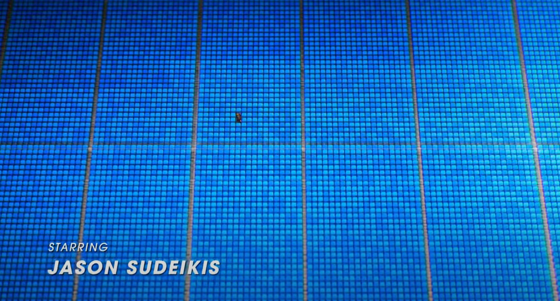
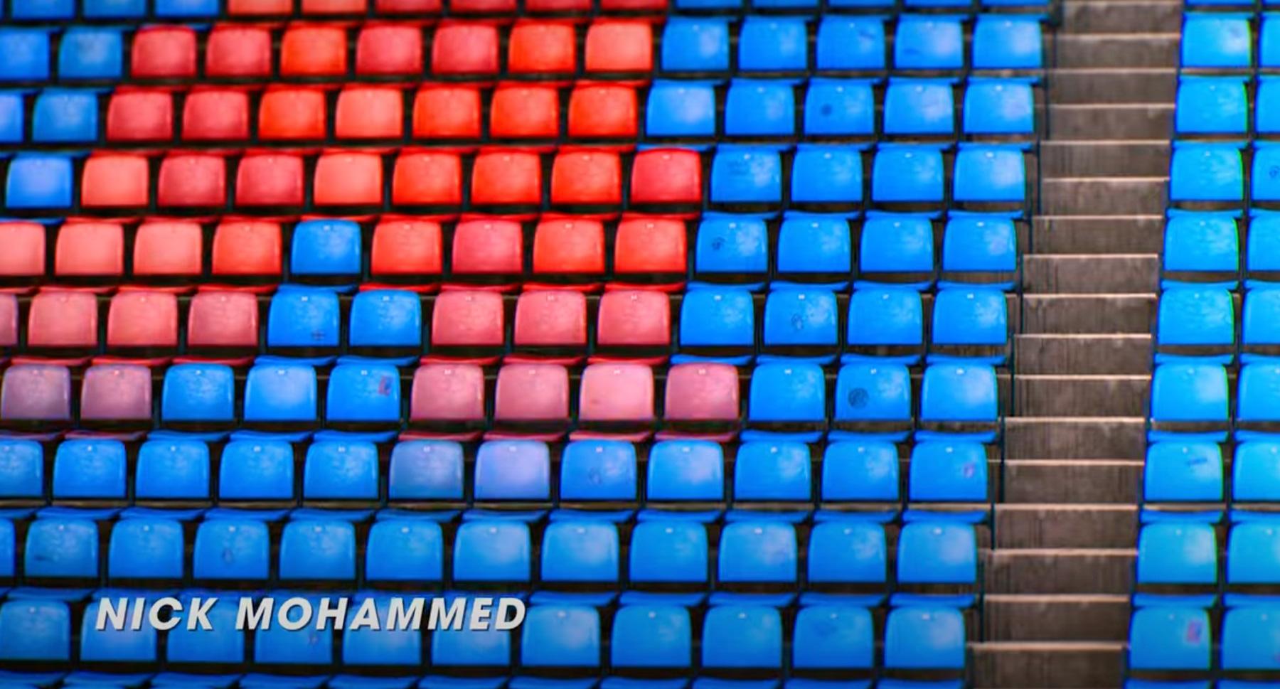
TED LASSO / SEMANTIZATION CATEGORY
In the titles created by the Yu+Co studio, for the Ted Lasso series, we observe how all the elements that make it up, reinforced by their editing, are at the service of a clear analogy that seeks to emulate the plot of the series.
Through the semantization of elements such as the stadium seats, we can see how they change color according to the sequence changes, until they form the name “Ted Lasso” on the grandstand. Thus creating a parallel with the plot of the series in which the character of Ted spreads among the fans of the team and the players and how he is earning a place in the hearts of all.
This is complemented with the use of a sans serif font for the titles, turning them into simple and legible lines. Accompanied by a very accurate musical selection by Marcus Mumford & Tom Howe, with the song “Water Tower”.
Video: www.youtube.com
Designed by: Yu+Co www.yuco.com
Music: Marcus Mumford & Tom Howe. (Water Tower).
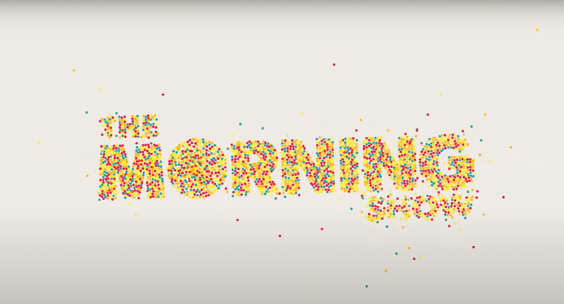
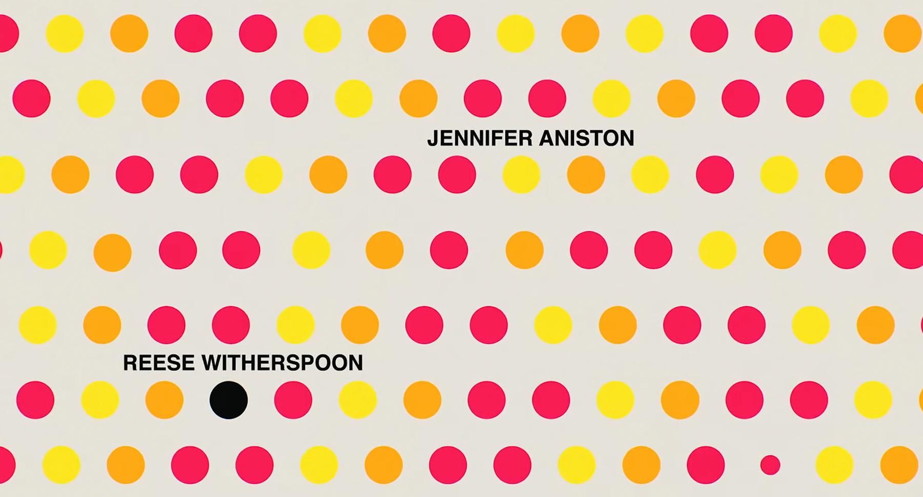
THE MORNING SHOW / SEMANTIZATION CATEGORY
For the opening of ‘The Morning Show;, we continue with the same line of approach through the semantization of resources, in this case with a completely different universe. With a clear reference to Swiss design from the use of simple and pure shapes, and a solid color palette, accompanied by the use of sans serif fonts.
Through a clean and neat editing of these components, they result in a parallel to what happens in the plot of the series without explicitly revealing, through the movements and transitions of these forms, the bid for power of its fictional characters.
Designed by the Elastic Studio, who was in charge of the design of renowned titles series like The Last of Us, House of the Dragon, Only Murders in the Building, among others. Accompanied by the soundtrack created by Carter Burwell, having as its main song the song, Nemesis by Benjamin Clementine.
Video: www.youtube.com
Designed by: Elastic www.makemakeentertainment.com
Music: Carter Burwell / Benjamin Clementine (Nemesis).
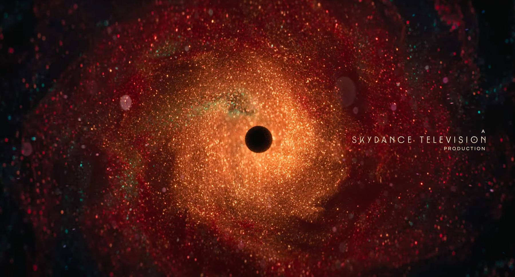
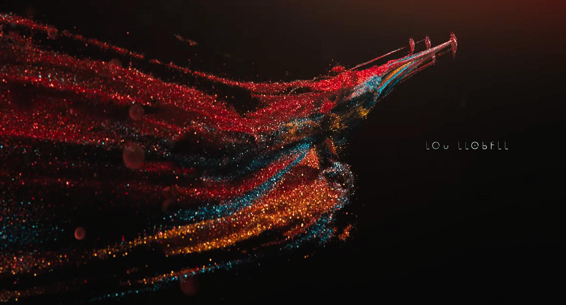
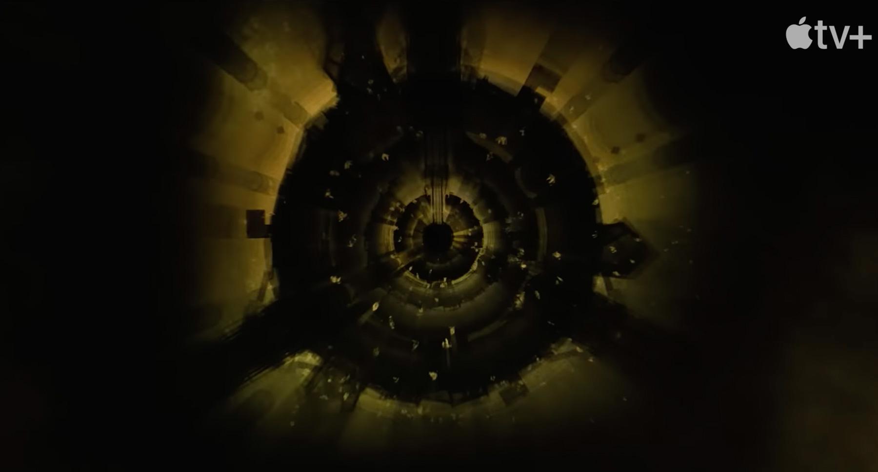
FOUNDATION / 3D CATEGORY
In this 3d piece created by the Imaginary Forces studio we find an environment of “Galactic Dream” as they themselves define it, loaded with elements that make a clear reference to the universe in which this story is framed, both in the series of television, as in the novels. They give us sequence by sequence through their editing a dynamism pertinent to that world, endowing it with sensitivity through the use of radiant colors, textures, and elements emulating cosmic particles.
Video: www.youtube.com
Designed by: Imaginary Forces. www.imaginaryforces.com
Music: composed by Bear McCreary.
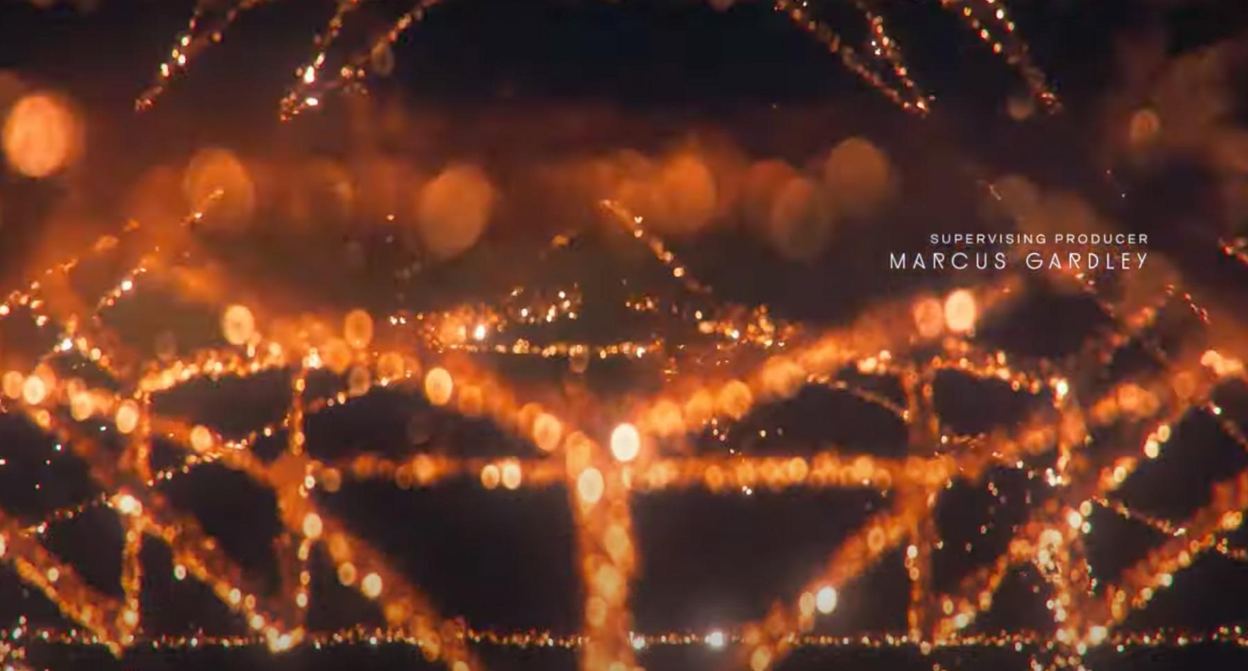
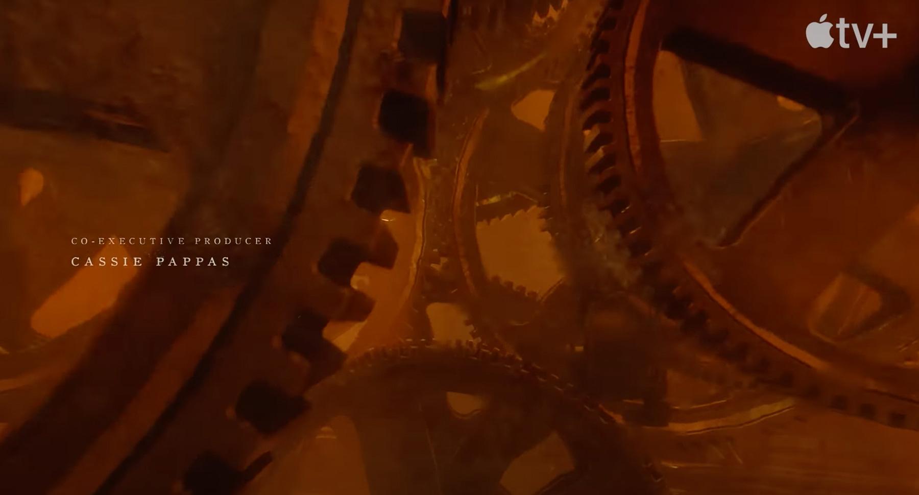
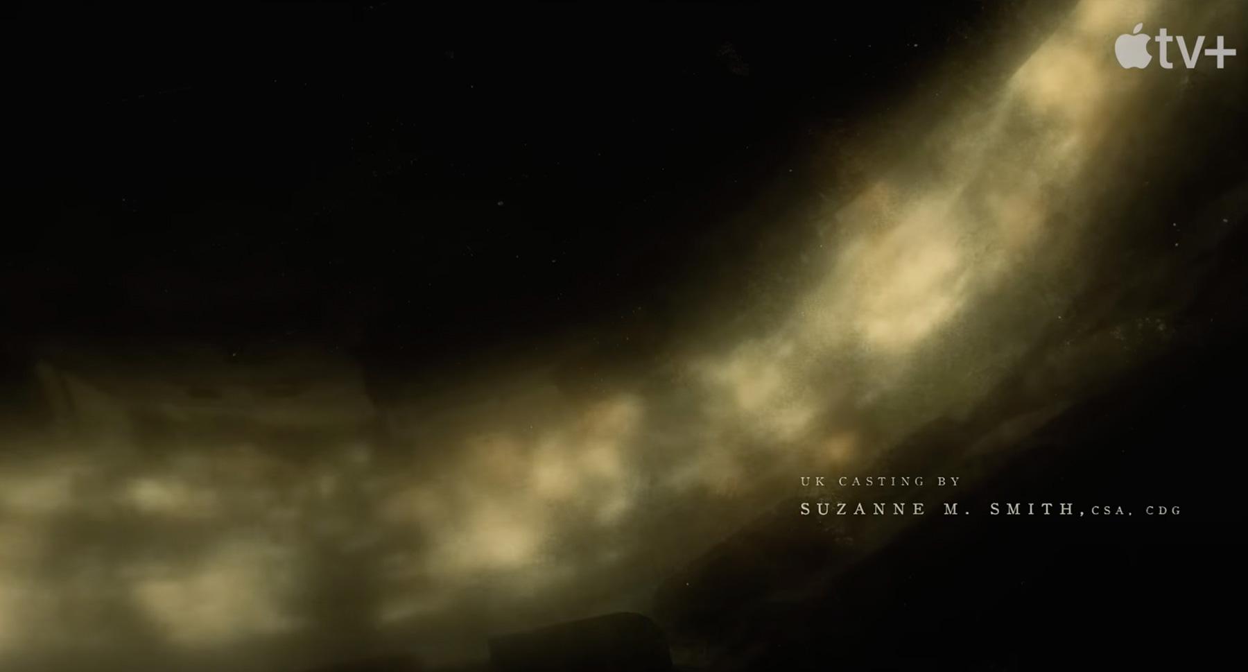
SILO / 3D CATEGORY
The titles of the ‘Silo’ series were in charge of the renowned designer Patrick Clair, who previously made the titles of acclaimed series such as True Detective, The Crown, Westworld, among others.
In this piece he plunges us into the depths of Silo, a self-sufficient underground city, in a sensory way, with a similar approach to the pieces analyzed previously, building these underground layers endowed with significant elements relevant to history.
The selected palette, the textures used, the simulation of volumes and the effects of particles in the air, all connected to each other, take us even further into this post-apocalyptic world.
In this case, unlike all the previous ones, we observe the use of a serif typeface, worked in two variables and with a subtle edition of kennings in it, resulting in a simple, elegant and legible typographic setting.
Another constant that we observe in these pieces is the music composed, in this case by the Icelandic Atli Örvarsson, acclaimed film and television composer, who previously composed the soundtracks for series such as Defending Jacob, Scandal, Law & Order (True Crime ), just to name a few.
Video: www.youtube.com
Designed by: Patrick Clair www.imdb.com
Music: composed by Atli Örvarsson
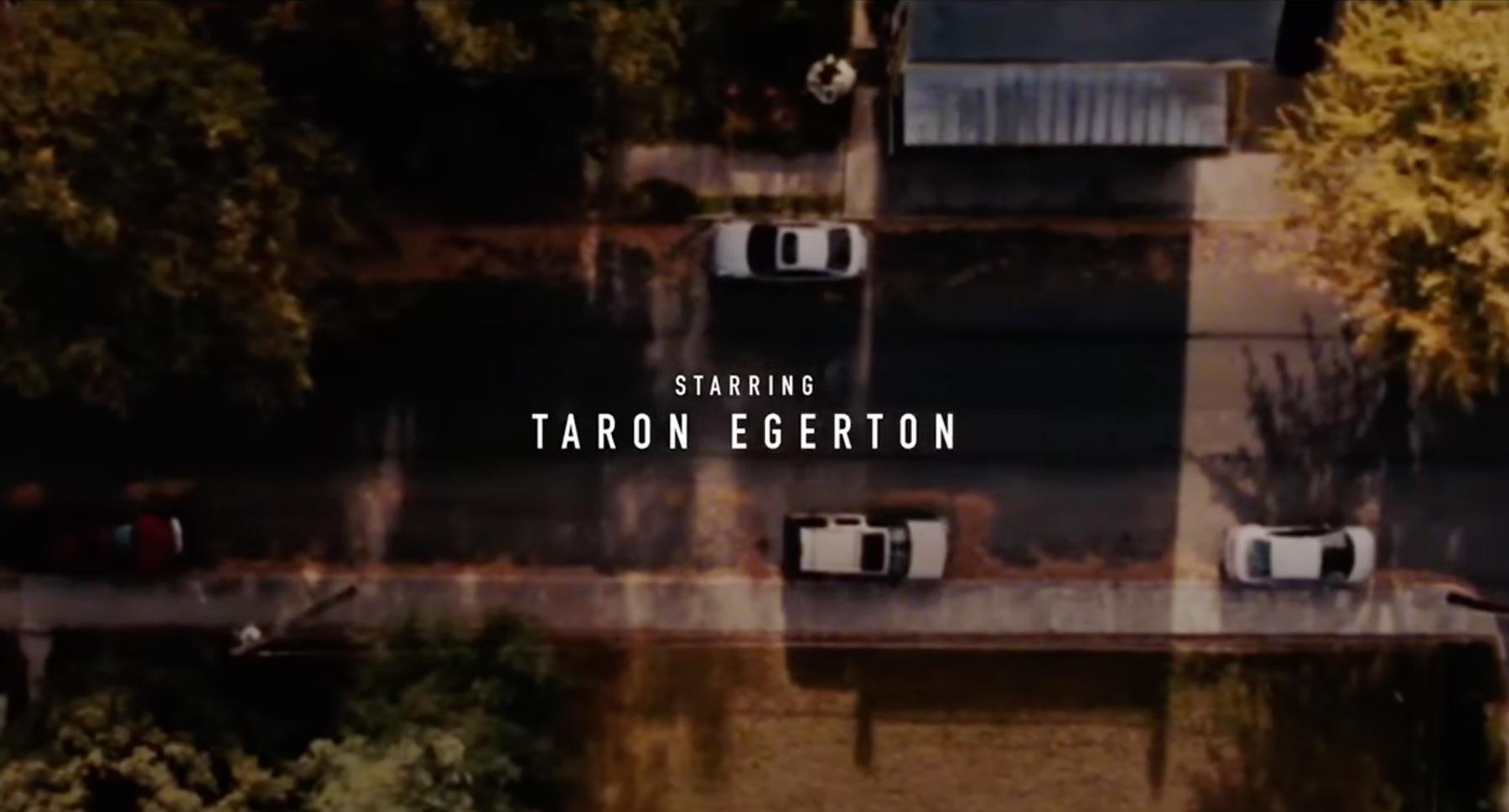
DEFENDING JACOB / PHOTOGRAPHY CATEGORY
Once again in charge of the Yu+Co studio, through impeccable cinematography and editing, they quickly induce us into an aura of a crime series, but without falling into common places, through elements placed in order to provide us with a prelude to the psychology of this crime. story, without revealing its plot.
In the typographic development we find ourselves again with the use of sans serif typefaces, with a subtle but very judicious edition of blur and fades on the typographic signs, which brings us even closer to the theme that is being presented to us.
Once again we have Atli Örvarsson, composer of the soundtrack, in mind.
Video: www.youtube.com
Designed by: Yu+Co www.yuco.com
Music: composed by Atli Örvarsson
BLACK BIRD / PHOTOGRAPHY CATEGORY
The ‘Black Bird’ title sequence, again by the Imaginary Forces Studio, brings us the union of the digital with the analog, in a dark and sinister montage.
Relying on the creation of photographic material and the compilation of VHS files from past decades, creating a proximity with the context in which this story takes place, giving it meanings relevant to the plot, resulting in an aura of threat and danger, in congruence with what the victims of these characters face.
For the typographic selection, we observe the combination of Sans Serif and Serif fonts, the first for the titles and the second for the title of the series, again as a common denominator of the analysis carried out previously, this treatment is simple and legible, but forceful supporting and reinforcing the climate of this film piece.
It has the participation of the renowned band Mogwai for the composition from the soundtrack.
Video: www.youtube.com
Designed by: Imaginary Forces www.imaginaryforces.com
Music: composed by Mogwai.
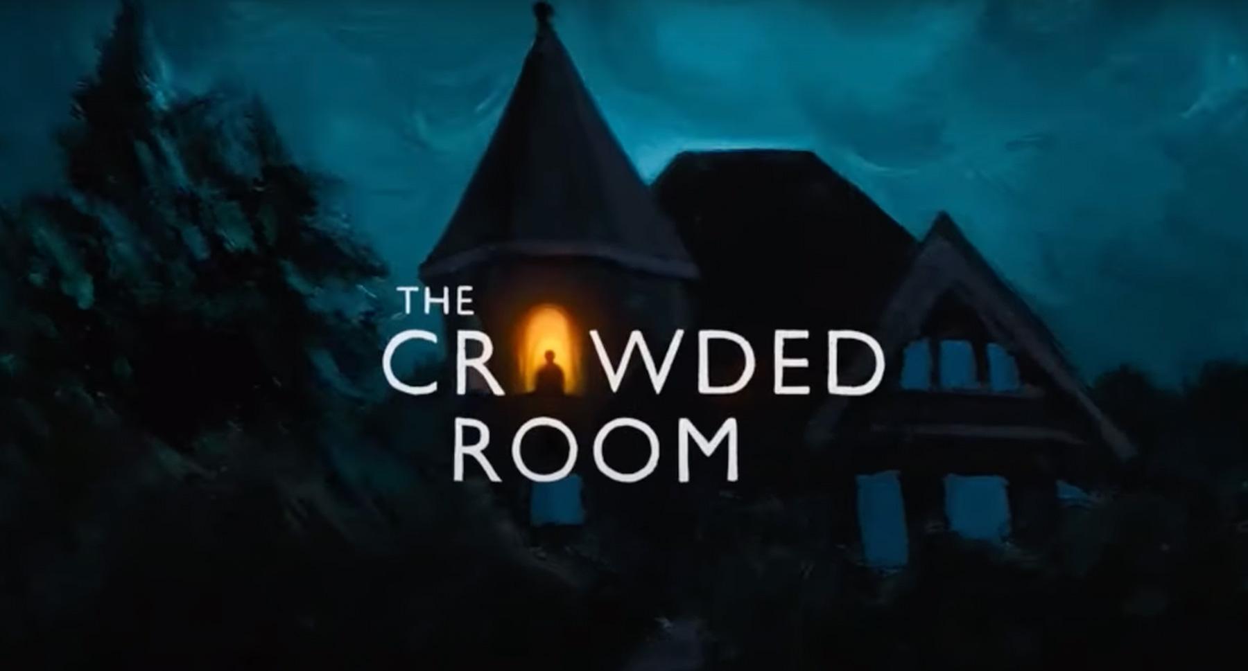
THE CROWDED ROOM / ILLUSTRATION CATEGORY
This sequence, designed by the Yu+Co studio, shows us through illustrations in a summarized way the journey that is carried out in the investigation of the central case of the series. We are denoting, through the passing of the sequences, to where this story is declining, without giving many tangible clues, but through an atmospheric route, the plot is built for us.
Through the textures that make up these dark illustrations which, sequence by sequence, immerse us more and more, with the use of reflections, shadows and a very accurate color palette, give life to that mysterious universe of the human mind.
As a common denominator we again find the use of sans serif fonts for the titles within the framework of a simple but effective composition.
Another highlight is the music for this piece: a piano solo, composed by Trevor Gureckis.
Video: www.youtube.com
Designed by: Yu+Co www.yuco.com
Music: composed by Trevor Gureckis.
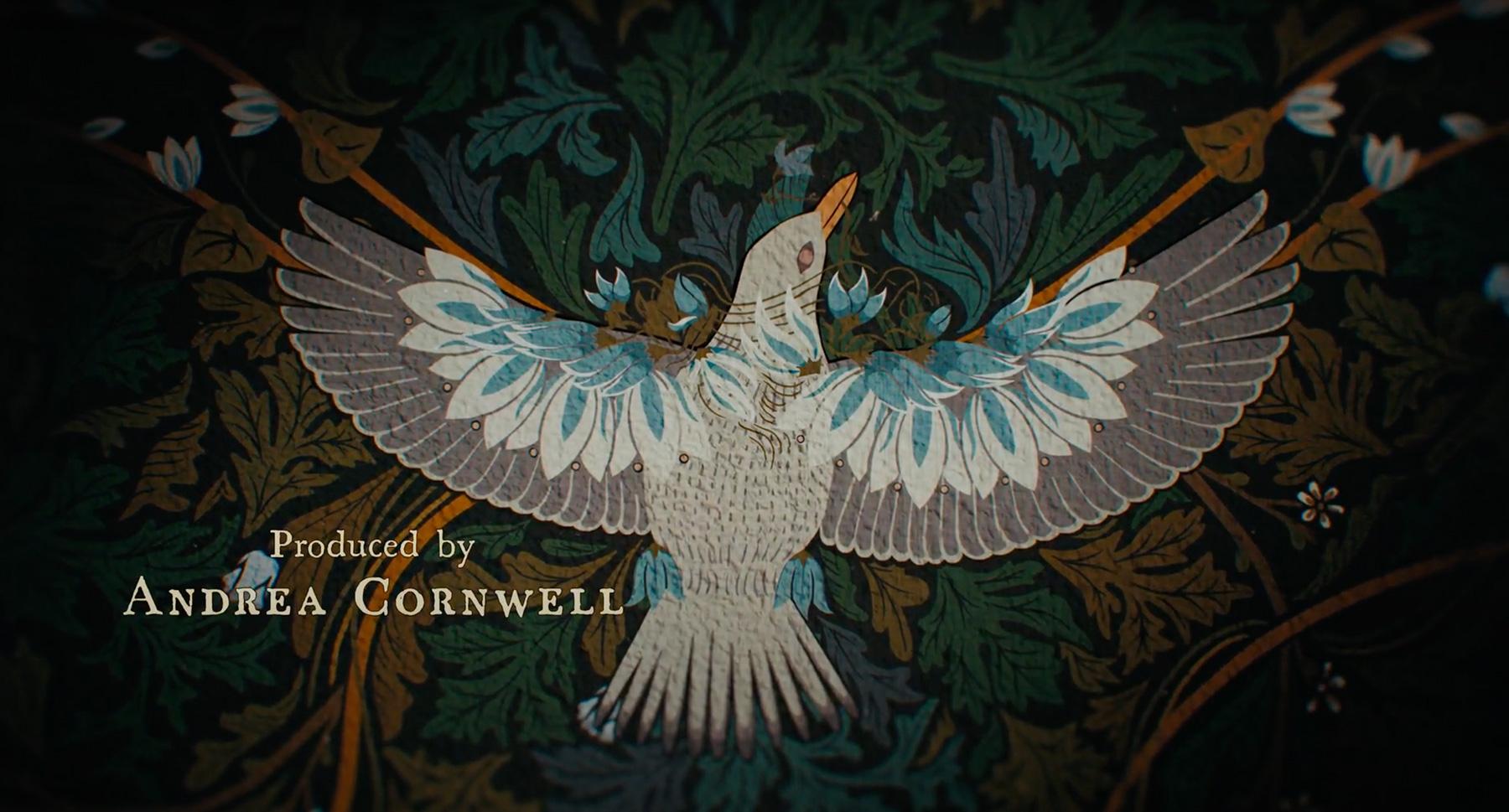
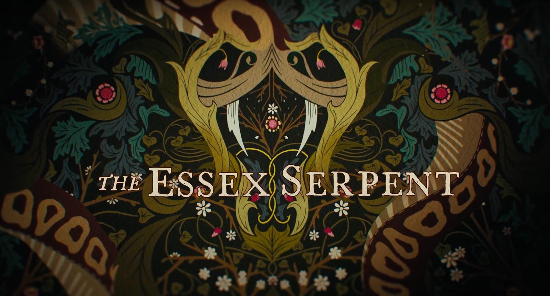
THE ESSEX SERPENT / ILLUSTRATION CATEGORY
For the design of these titles we are once again in charge of the Yu+Co studio, in this piece they bring us, as in the titles of The Crowded Room, a 100% illustrated proposal reminiscent of graphic styles from the Victorian era, using resources like arabesques and flourishes, forming different ornaments.
With a selection of colors intervened with textures and accompanied by its typographic use, in which we observe an old serif typeface, which also has a treatment in which the termination that the fonts had in the forms of the Victorian era is emulated.
All these elements carried out by means of a perfect edition, accompanied by the music composed by Dustin O’Halloran & Herdís Stefánsdóttir, immerse us from the first moment, in this universe where the scientific, the religious, nature and myths coexist.
Video: www.youtube.com
Designed by: Yu+Co www.yuco.com
In summary, after a tour stopping at each particularity of this selection of sequences, we identify in greater detail the constants and variables that appear in them through the different approaches that the different studies made to arrive at these film pieces. We were able to give a more detailed account of that thread that is often tangible and sometimes not so much that unites them and undoubtedly identifies them as a product made for Apple TV.
All images attached to this article are not property of Lorem Ipsum and were crafted by the artists mentioned above.


