Thursday, July 31st 2025
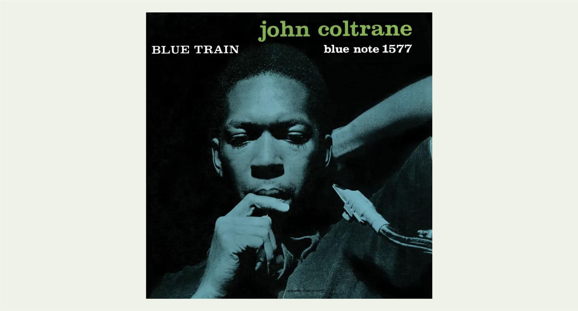
The year 1957 marked a new beginning for John Coltrane. The release of Blue Train under the Blue Note label established him as a composer; It was also his first album recording as a bandleader. Today, Blue Train is regarded as one of the most iconic and influential jazz records of all time. Coltrane himself selected it as his favorite one among his own records. The music and the band are outstanding, of course. However, Blue Train might mean much more to Coltrane than its inherent artistry.
"Today, these albums covers are sacred jazz iconography"
After struggling with his own demons, Coltrane’s wake up call was getting fired from Miles Davis’ band in 1957. He had joined Davis’ group in 1955 and they became arguably the most iconic jazz duo in history. Think Lennon & MaCartney, Page & Plant, Jagger & Richards…well, John Coltrane and Miles Davis are probably the most influential duo of the lot. Together they recorded many albums, including the very popular Kind of Blue, considered by many to be the greatest jazz album in history. In this context, Blue Train acquires a special significance for Coltrane–one of new beginnings and of the rewriting of his own story.

Before Coltrane found his new beginnings, Francis Wolff, an accomplished Jewish photographer living in Berlin, caught one of the last unrestricted boats out of Germany in 1939. He sailed towards New York to find his own new beginnings. Once there he joined forces with his childhood friend, Alfred Lion, who had founded a record company. This record company was called Blue Note. Among other co-managing roles, Wolff became the official photographer of the recording sessions. Blue Note went on to become one of the most influential jazz labels of the mid-20th century, “noted for its role in facilitating the development of hard bop, post-bop and avant-garde jazz, as well as for its iconic modernist art direction.”
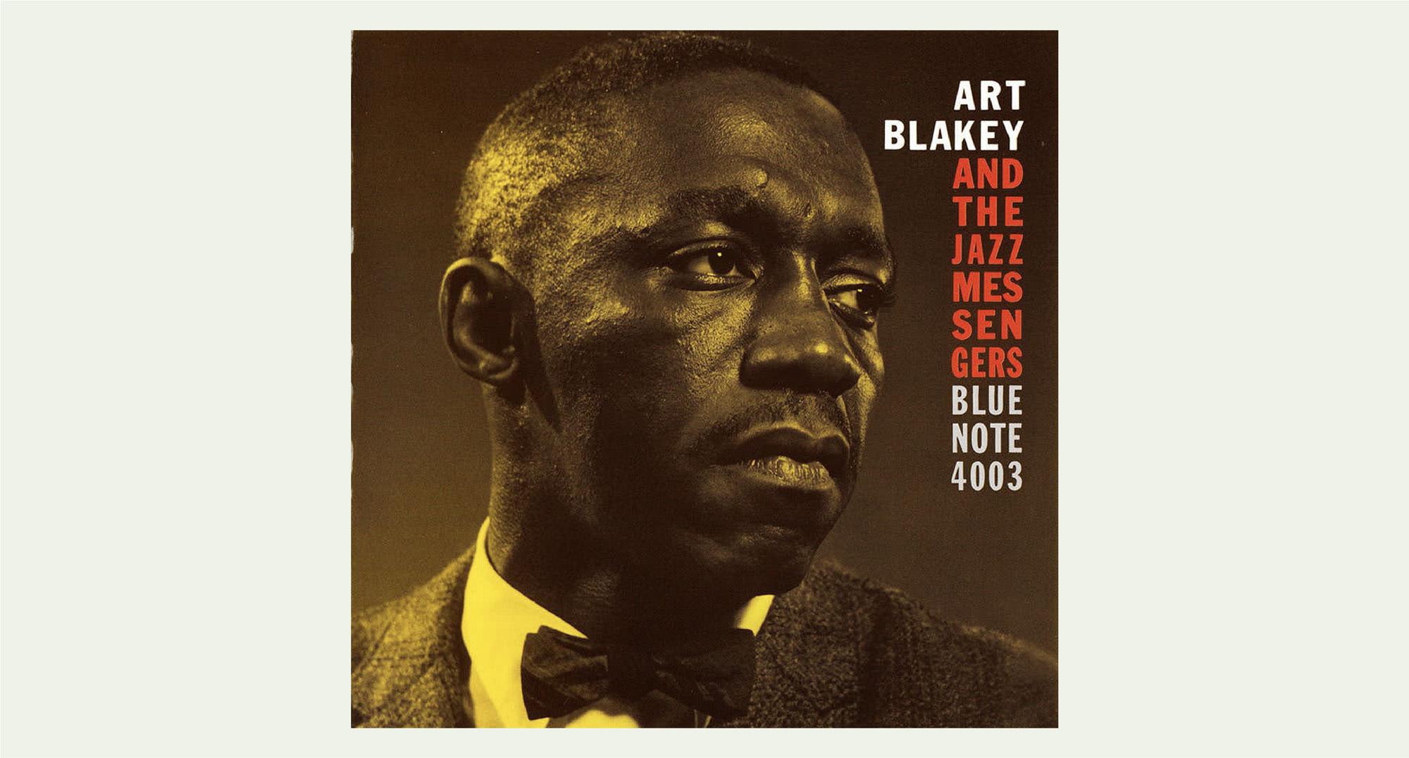
During the 50’s and 60’s, it was impossible to enter a record store without noticing Blue Note releases. Today, these album covers are sacred jazz iconography. Their minimalist designs, which included bold typography and intimate and candid pictures of artists in the midst of their recording sessions, became a sort of seal of quality to the incredible music inside. As a teenager in the 90’s who was trying to get his hands on as much music as he could, I came across Art Blakey & the Jazz Messengers Moanin’ album. I had no idea how it would sound. My record collection at the time was mostly filled with overdriven guitars–jazz music was a distant frontier, but I was intrigued by the album cover. Especially the yellow layer that is over imposed on Blakey’s picture. I just liked the look so I got it. Also, I felt it wasn’t overwhelming like other records. I could see the artist’s face, their name, who they were playing with and the record label’s numeric code.

I got home and placed the compact disc on my CD player. I was blown away. Why was this music that was so new to me somehow so familiar? Art Blakey’s drumming in The Drum Thunder Suite reminded me of Led Zeppelin’s Dazed and Confused and Moby Dick. The problem was that Blakey’s album was released ten years before both of these songs! I figured that if my idols were listening to music like Art Blakey’s for inspiration, then I should do the same. I returned to the record store, but this time I knew what I was looking for. There were a few other records with similar album covers and I started getting them. This way I discovered Speak No Evil by Wayne Shorter, Page One by Joe Henderson, Something Else by Cannonball Adderly and of course, Blue Train by John Coltrane, among others. There was something about these Blue Note records that drew me in. I could not understand it at the time, but those album covers were my entry point to a music genre that has defined so much in my life as a musician.
A lot of these album covers were the result of the collaboration between photographer Francis Wolff and graphic designer Reid Miles. They are credited with designing most of Blue Note’s album covers from ‘55 to ‘65. Wolff’s experience as a photographer yielded a great success rate. He was able to get a considerable amount of good pictures in every recording session. He would then share them with Reid Miles who would choose one for the album cover based on a few things. He was mostly looking for an interesting crop that would allow him to carry out his typographic experiments.

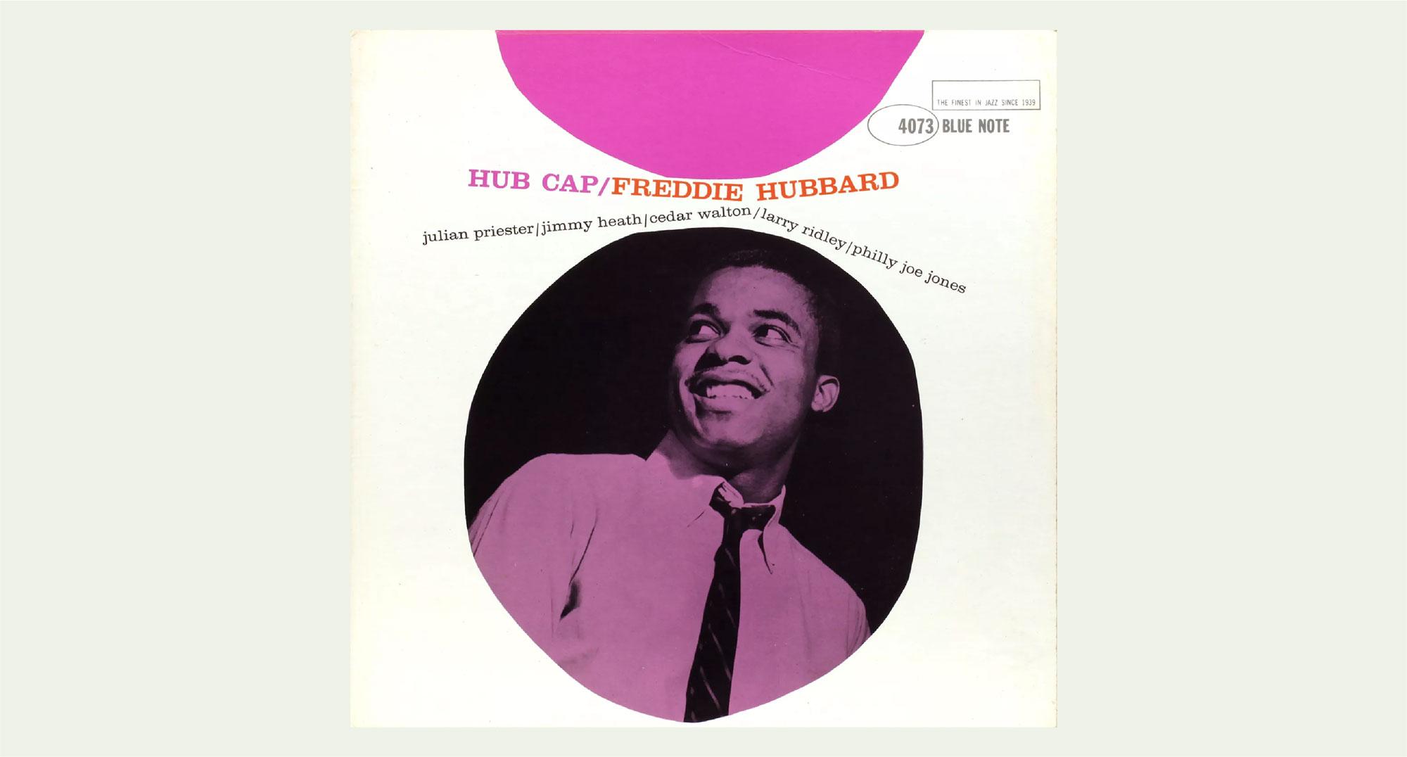
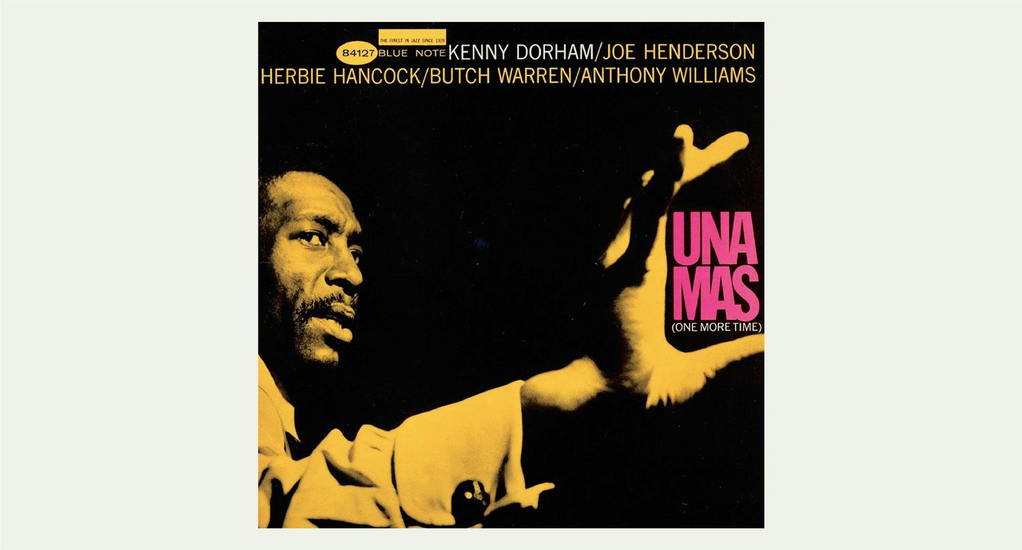
A good example of these elements at play is Hub Cap by Freddie Hubbard. In this album cover we can see an unusual but creative crop, a candid picture with overimposed colors, bold typographic layouts and the ever present numeric label code. All of it curiously working well together, composition wise. Another good example of an interesting composition is Kenny Dorham’s Una Mas album. Miles chose to crop the picture in a way that would allow him for an unusual and defiant text placement. The name of the album stands out in a bright (magenta?) that contrasts against the yellow layer that is over imposed on the picture.

All images attached to this article are not property of Lorem Ipsum and were crafted by the artists mentioned above.


