

Thursday, August 21st 2025
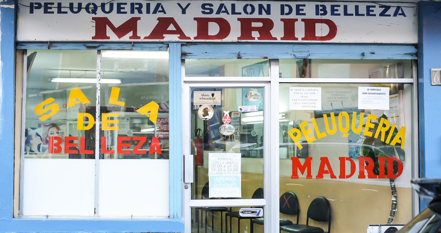
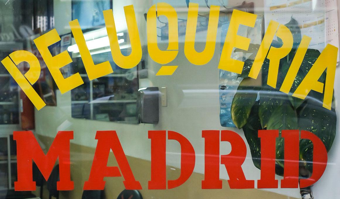
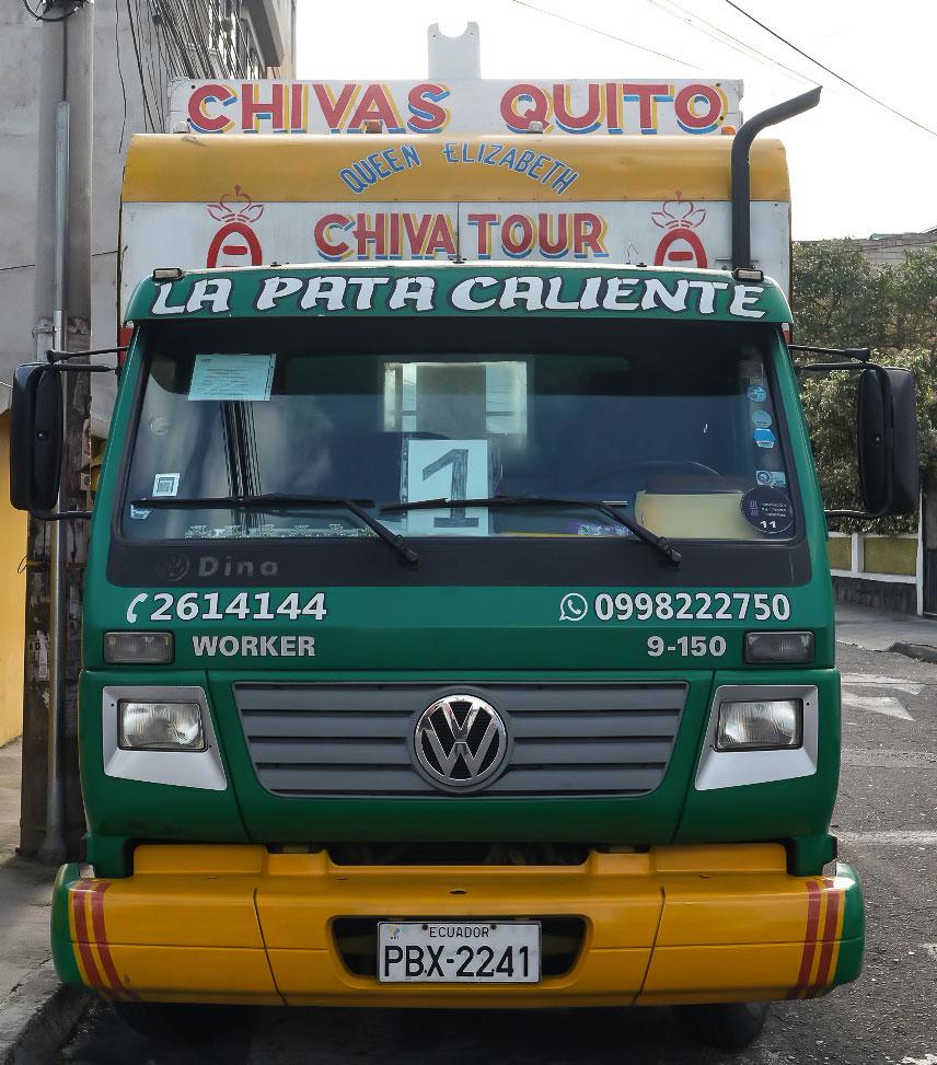
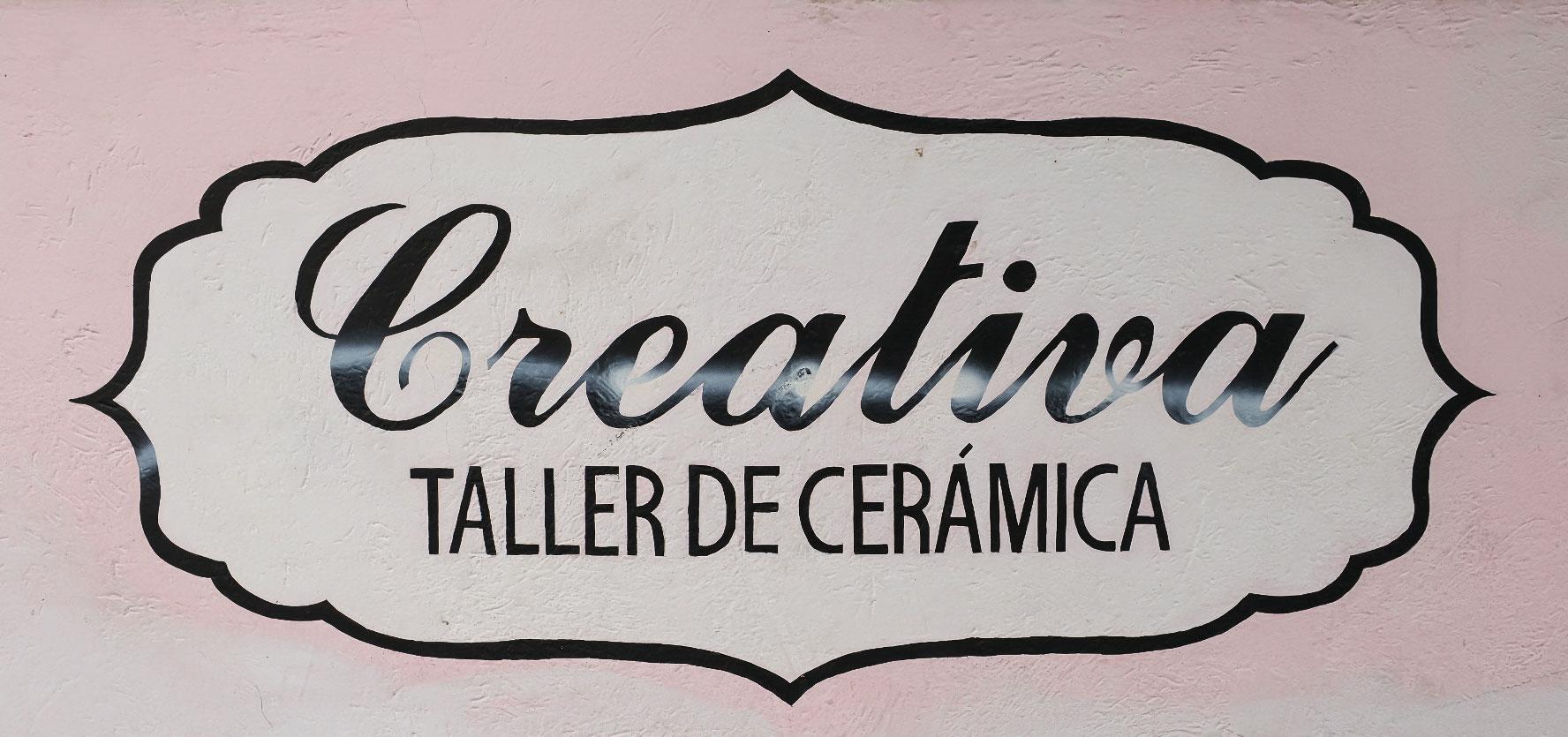
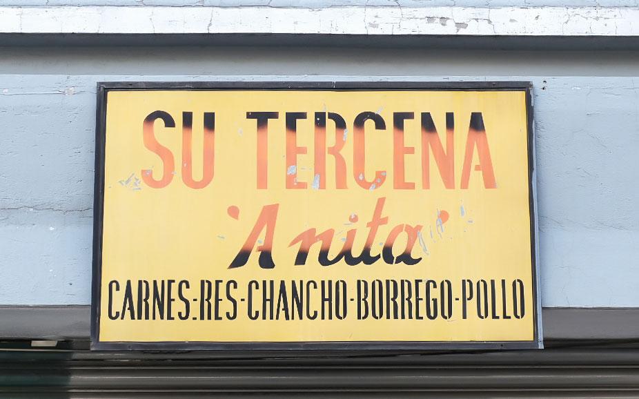
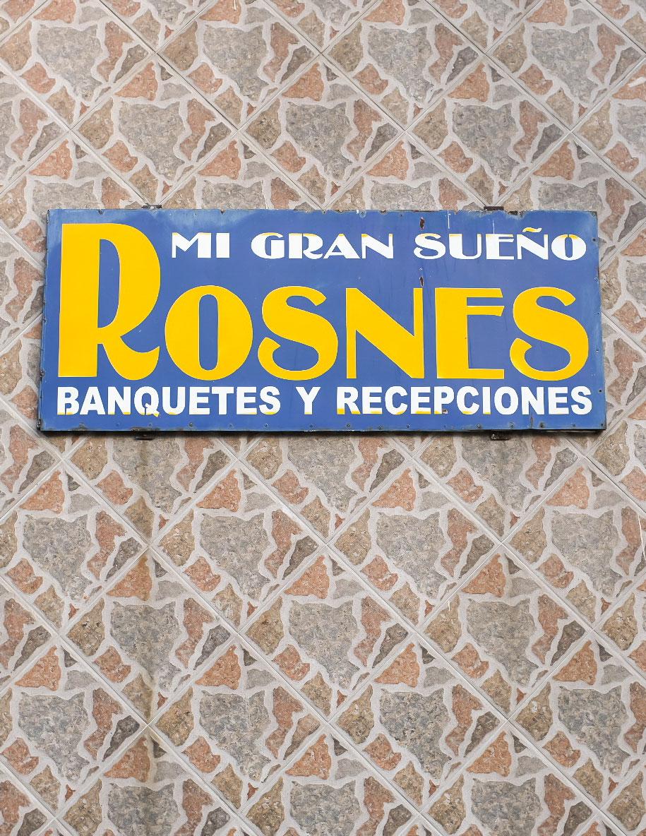
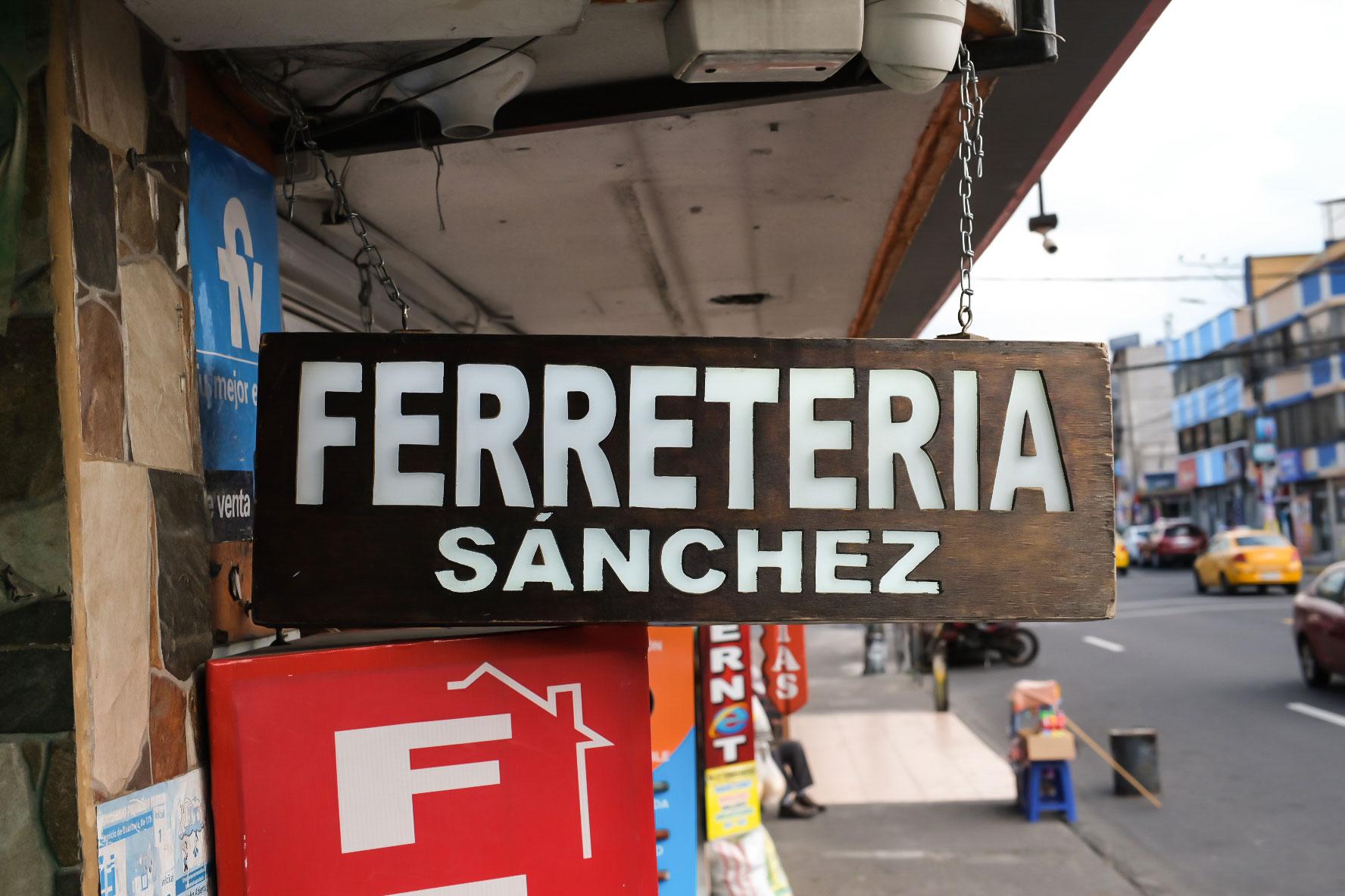
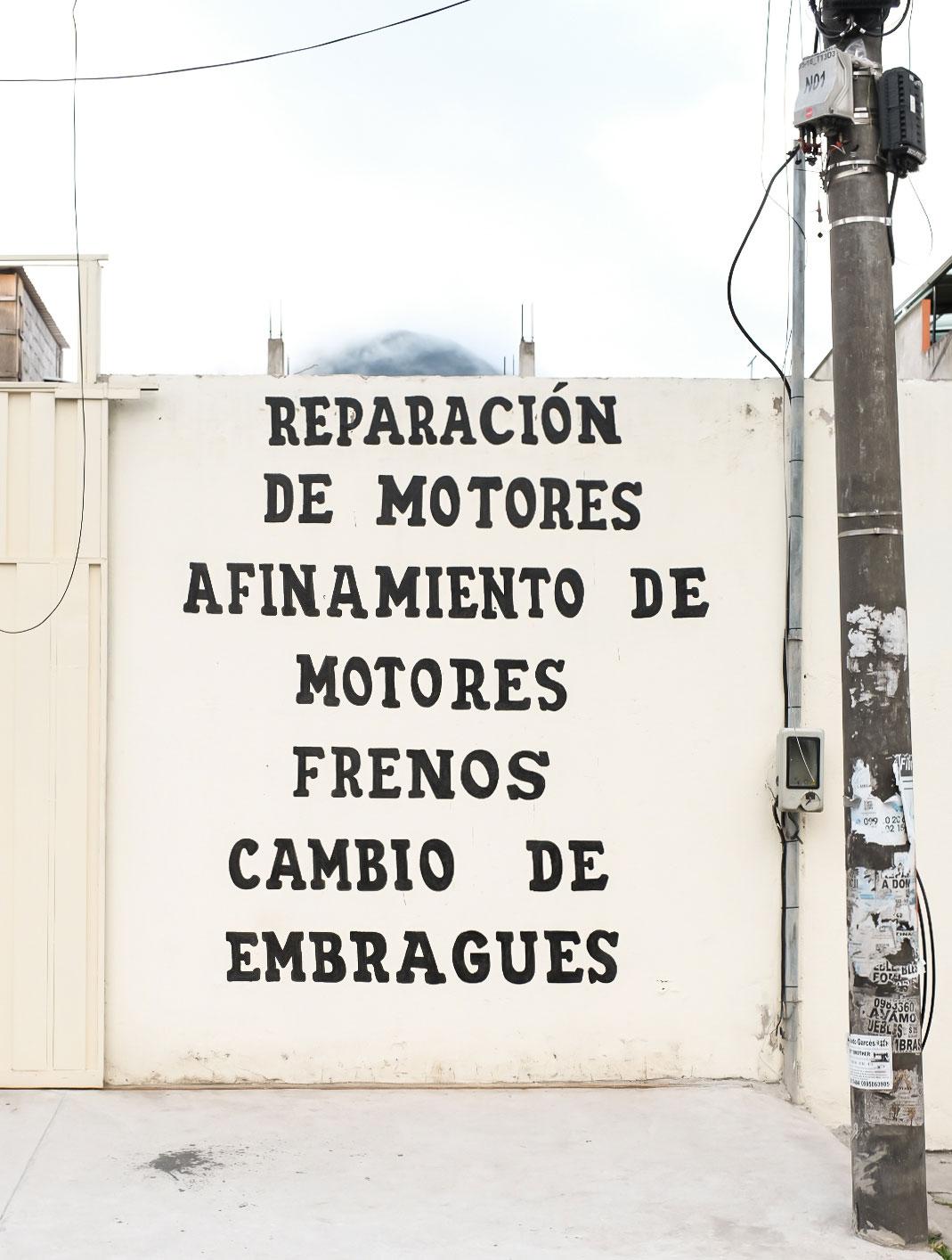
There is often more than one side to the same story. Cities are full of stories and there are many ways, implicit and explicit, in which we can get a glimpse of them. The typography used in a city’s advertising and signage can help to shape its identity in the minds of both locals and visitors, communicating a sense of the city’s character and values in a way that is both subtle and powerful.

"Cities are full of stories implicit and explicit"
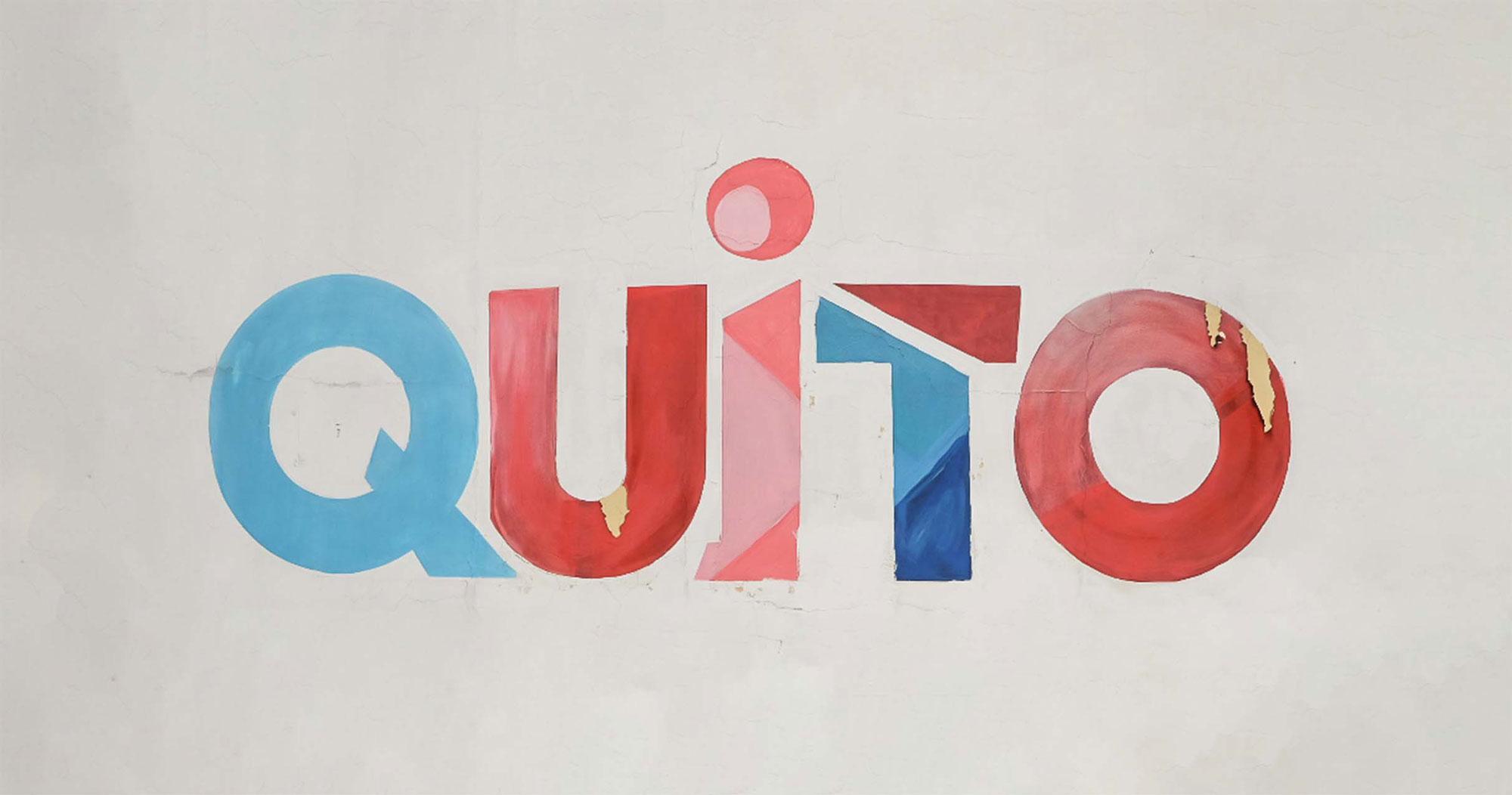
In this entry we share some of the typography we found while roaming the busy streets of Quito: a city surrounded by volcanoes and one of the oldest cities in all of South America. The city was originally founded by the Quitu tribe, an indigenous people who inhabited the region long before the arrival of the Spanish conquistadors in the 16th century. The Quitu settlement was later conquered by the Incas, who incorporated the city into their empire and used it as a strategic center for trade and administration. Following the Spanish conquest of the region in the 16th century, Quito became an important colonial city, with a rich blend of indigenous, Spanish, and African cultures.
Beyond the stories that resulted from the coming to be of Quito, there are other more abstract stories out there. Through the typography and the design of its signs — those who were industrially printed, and those who were meticulously hand painted — we can catch some of these untold stories…if we are paying attention.

All images attached to this article are not property of Lorem Ipsum and were crafted by the artists mentioned above.


