

Thursday, August 21st 2025
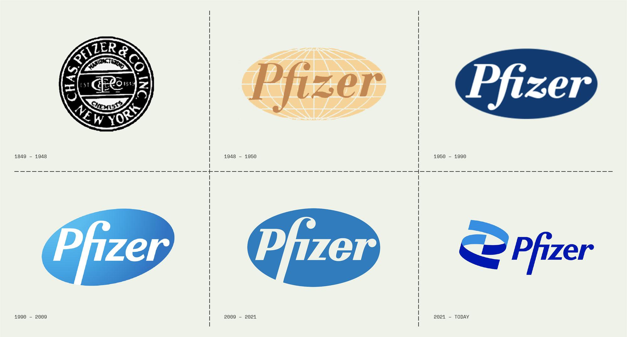
The old saying goes “if it’s not broken, don’t fix it”. But, can this be applied to brands? Seeing a well-known brand take their classic, familiar logo and revamp it, ain’t new. We’ve seen it time and time again in past years: McDonald’s, Instagram, Pfizer, MasterCard, Sprite… Even Taco Bell did it! Two questions come to mind: one, why? And two, did they need to?
First, we have to establish that there’s a difference between a refresh and a rebrand. According to HubSpot, a refresh “is a strategic set of changes made to a brand’s identity to realign with current marketplace trends”, while a rebrand is “is a complete overhaul of the brand’s identity and strategy, typically enacted when the current brand strategy fails”. The brand refresh is an attempt to modernize the look and feel of the company’s identity while staying true to its core and main strategy. Basically, a refresh is painting a few walls while a rebrand is taking them down and calling a contractor to redo the whole thing. The rebranding could include changes in key business elements like mission & vision, positioning, values and guidelines. So, for now, we’re going to focus on refreshing/redesigning.

"Logo redesigns are either a miss or a hit, there's no gray area for this one"
The word “refresh” comes up when a brand feels like it needs an update to stay current and relevant… and they’re not entirely crazy, sometimes brands need a graphic nip and tuck here and there to give them a new life and be able to communicate properly with a new, younger audience. There’s a difference between having a classic logo that works and having a dated brand identity that is just demodé. This refreshment includes elements like the logo, the font, the color palette, the slogan and even the voice & tone of the brand. And it can make total sense when done right if you think about it, a slogan from the 50s is not necessarily going to make sense or connect with the audience when we’re doing the ‘Bloody Mary’ dance on TikTok instead of the bunny hop or the twist.
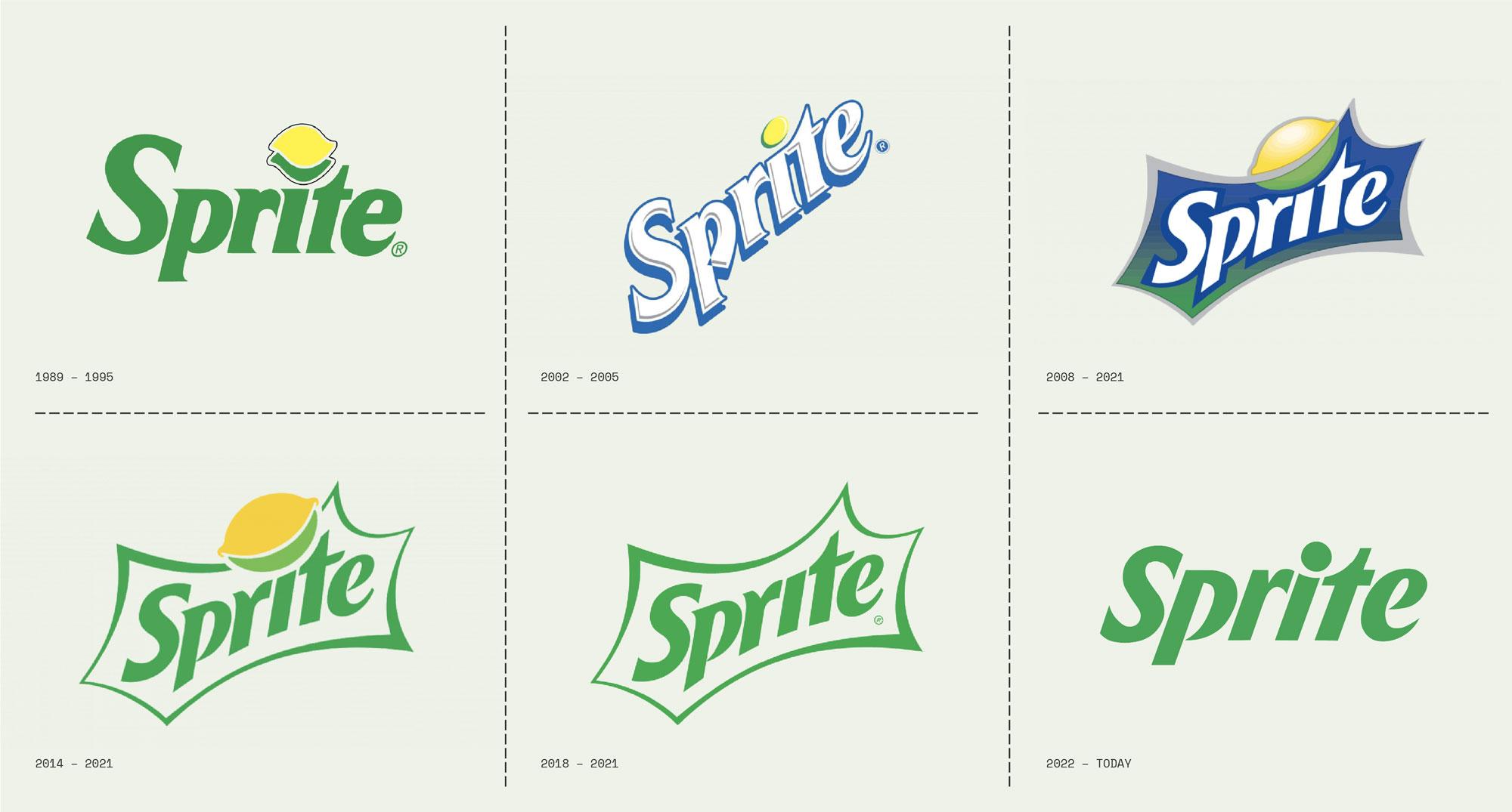
Logo redesigns are either a miss or a hit, there’s no gray area for this one and there’s very little room to predict how the public is going to answer to a very drastic change. Sometimes brands feel so desperate to look modern and “hip” that they basically kill the essence, the appeal and even the coolness of their original logos in order to make them fit the latest market trends… and all logos from all companies end up looking pretty much as if the same studio designed all of them. One trend on redesigning that we can get behind is retro-vitalizing, which basically means going back to the brand’s roots and using modernized classic elements to push it forward to current times (heritage and nostalgia play a big part here).

So, yes, refreshing a brand’s logo is not always a bad thing… but, before you make that jump, make sure you NEED to do it and make sure you do it the right way – easier said than done, huh.
Sources:
All images attached to this article are not property of Lorem Ipsum and were crafted by the artists mentioned above.


