Monday, April 28th 2025
The conversation surrounding more inclusion in our industry isn’t new luckily, and progress has been made in the right direction. Both agencies and brands are more aware of this now and the need for BIPOC and queer voices to be heard and their work to be seen, is nowadays an industry standard–even a must for some when it comes to choosing a company or a product over its competition. Yes, the way most of us approach visibility and inclusion has shifted but, when we say we have a long way to go, we mean it.
"Most typographies are not contemplated to be used in non-latin scripts"
One of the key elements of graphic design is typography. The right (or wrong) typeface can make (or break) a project. In the last few years, we’ve seen technology move in the right direction when it comes to making it more broad and inclusive for non-Latin scripts users, saving both time and money for both designers and studios. For example, you have the type design software Glyphs, which has proven to be quite user friendly according to the testimonies online of Asian designers, as well as the Japanese version of InDesign. Many East Asian character sets need thousands of characters to be usable and functional, the actual process of designing a full Japanese font can take years between the processes of planning, drawing and testing.
You also have the development of OpenType, a format that allows the programming of contextual forms, ideal for languages of the SWANA region like Arabic; usually it’s really hard to fully express the nuances of its calligraphic written language.

While you have all these relatively new technological advances, there’s still a core problem that needs to be fixed: the actual ideation process and designing of the typefaces. Most typographies are not contemplated to be used in non-Latin scripts, leaving out a huge chunk of designers worldwide, and no, this is not inclusive at all. Designers stumble upon tons of original typefaces on social media and websites on a daily basis, but how many of them are actually designed thinking they will be used in a non-English speaking context? That’s the question/the problem. And the solution it’s in our hands, literally. As graphic designers, how diverse is our POV/creative process? How can we nurture it in a way that includes the sensibility and needs of others?


The proper usage of typography combined with the right design elements can be game changers with palpable cultural impact. Take for example the re-design studios do to their movie posters to adapt them to the market they’re targeting, more specifically, the Japanese market. While what can be considered a good poster (from a design standpoint) can attract fans to watch a particular movie, a great poster has the potential to become a piece of pop culture on its own. Movie posters were even more important during the mid-20th Century for Japanese cinephiles, as its designs not only had to be visually appealing but also culturally suitable, said posters had the job of breaking down the cultural and language barriers that separated them from their international siblings.
These adaptations are very heavy on graphic elements, and this presented a challenge for artists in terms of timing and resources; according to Sabukaru Online, “studios in Hollywood and other parts of the world provided distributors with a limited number of design resources, like photos of actors and actresses, images of official props, and color palettes… For these reasons, designers constantly had to overcome challenges by using still frames from trailers and pre-screening copies, and making and shooting props themselves. Yet, the logo design was the trickiest part, since they had to adapt the title to a totally different writing system, without leaving aesthetics and cultural needs behind”. In other words, it was a very complex process due to cultural discrepancies, and it shouldn’t be.
Every crevice is connected to typography somehow, which ultimately is nothing more than shapes and forms with meaning, a tool for art and expression to convey a message. If you are a type designer, you have the power to literally change the way industry works. Every small contribution plays its part, think big the next time you’re developing a new typeface. Many others will thank you.
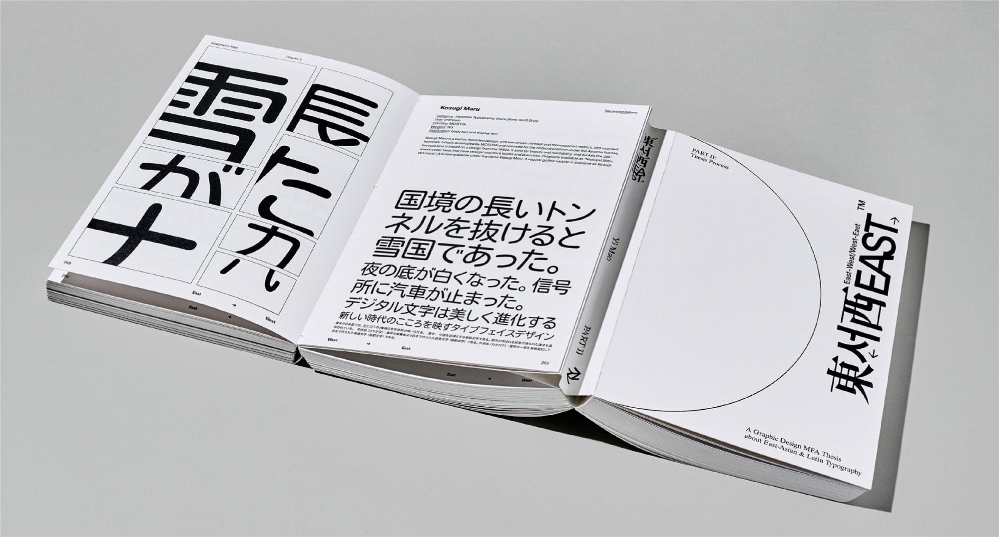
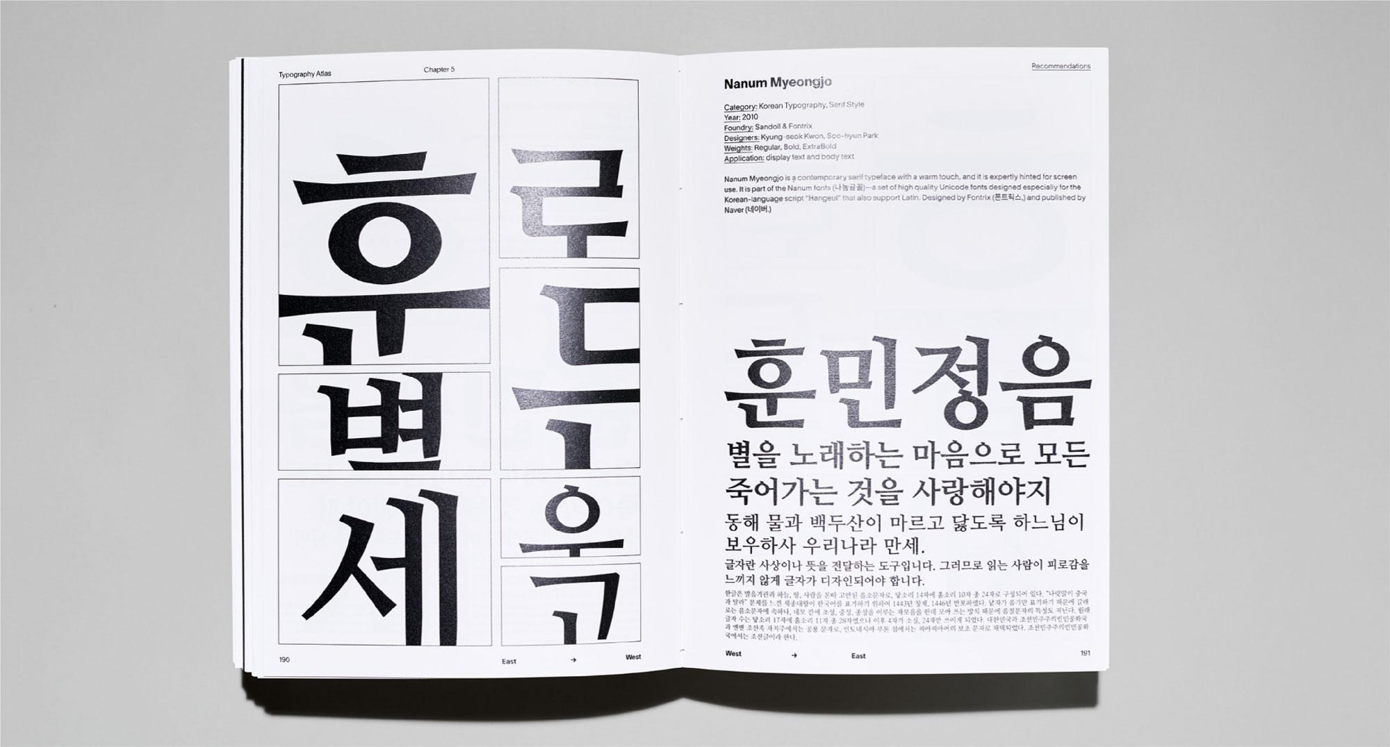
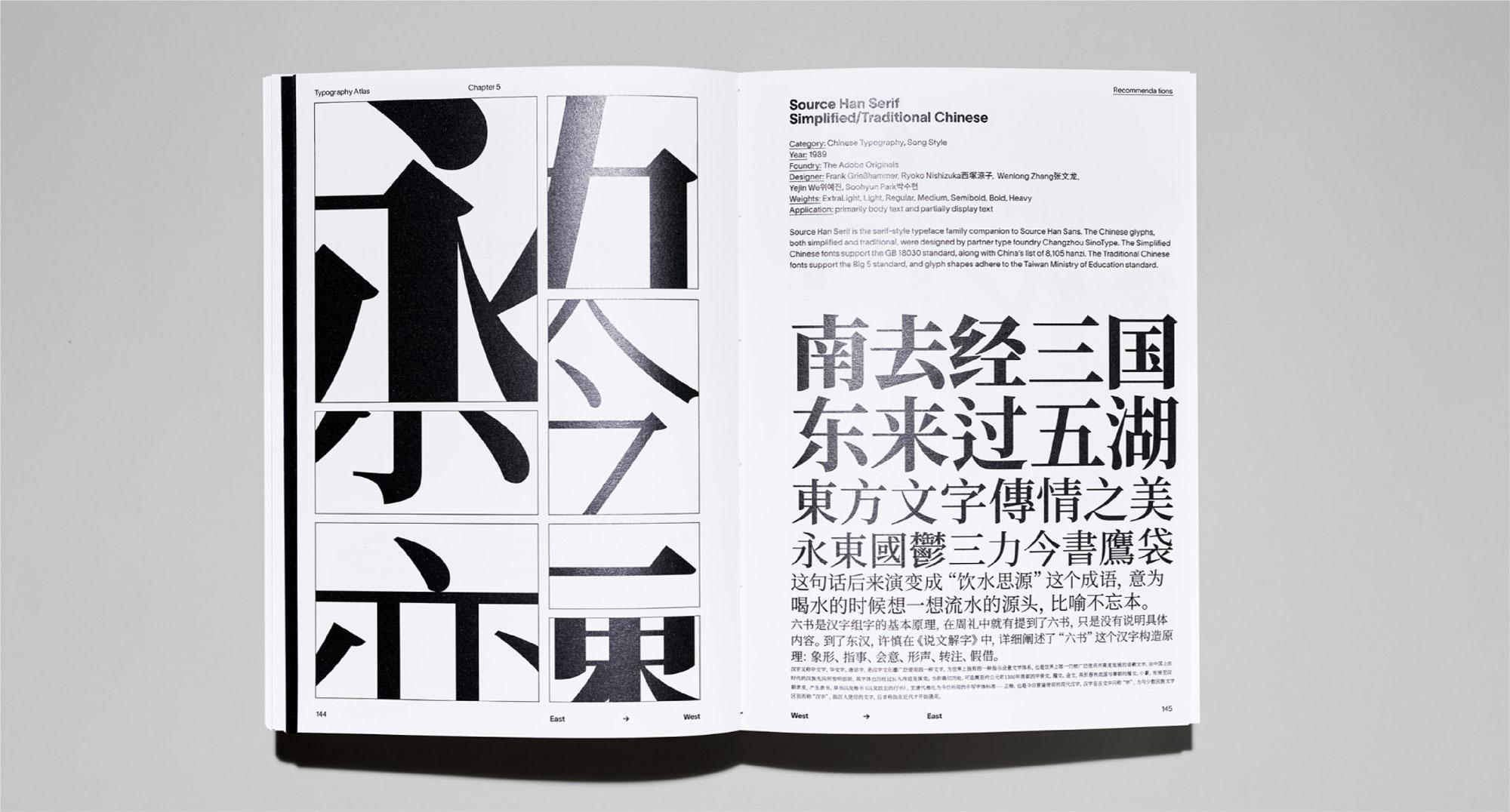
Behance Project by: Yi Mao – “East-West/West-East” typography reference book
Movie Posters Designed by: Hiroku Higaki.
Sources:
All images attached to this article are not property of Lorem Ipsum and were crafted by the artists mentioned above.


