

Thursday, August 21st 2025
Have you ever wondered how important branding is for, well, a brand? Yes, it’s very important. And have you ever wondered how difficult it is to properly develop a branding strategy? Yes, you guessed it, it’s not easy. But for WhyNotDesign it’s their bread and butter, and not only that, it’s their specialty. WhyNotDesign is a design organization that focuses on packaging and branding design, it was founded in Shenzhen in 2022 and it is “committed to providing multi-disciplinary and multi-category design services for Chinese super brands” – it even says it on their Behance.

"The non-english speaking world is used to consuming american content with subtitles since they can remember"
Based on the profound understanding of commercial design and rich project experience, WhyNotDesign’s works keep a good balance between design level and business value. The founder (He Yuxuan) dedicates himself to integrate typography into his cross-cultural and commercial design projects, which incorporate traditional and modern, eastern and western design perspectives. With the aim of bringing niche culture to the mass market, He Yuxuan and his company continue to explore the limits of design in all aspects. So far, they have won more than 50 international design awards for their branding and packaging efforts.
Making eastern culture an appealing product for western culture to consume as is without trying to remake it is a challenge, we see it on tv shows, animation and cinema all the time, with Asian creators having their movies and anime shows being turned into Netflix adaptations that lack the soul and innovation that made the original product relevant in the first place. Yes, there’s a language barrier there, but the non-English speaking world is used to consuming American content with subtitles since they can remember, why can’t it be the other way around as well? WhyNotDesign’s work is very graphic and it’s heavy on text elements all over, especially because the western market is not their main market, so getting their messages across to an English speaking audience is neither a priority nor a concern for them. But when it comes to good design, you don’t necessarily need to get the cta for you to appreciate a well done, thought out piece, and this is the case for WND.
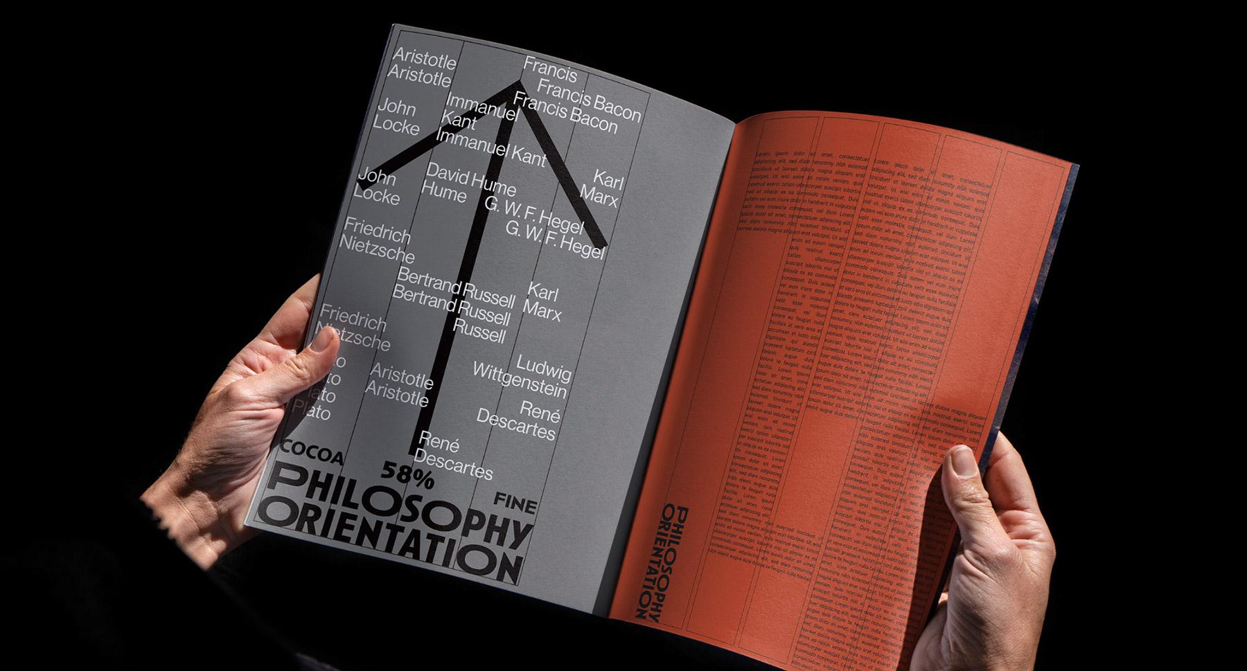
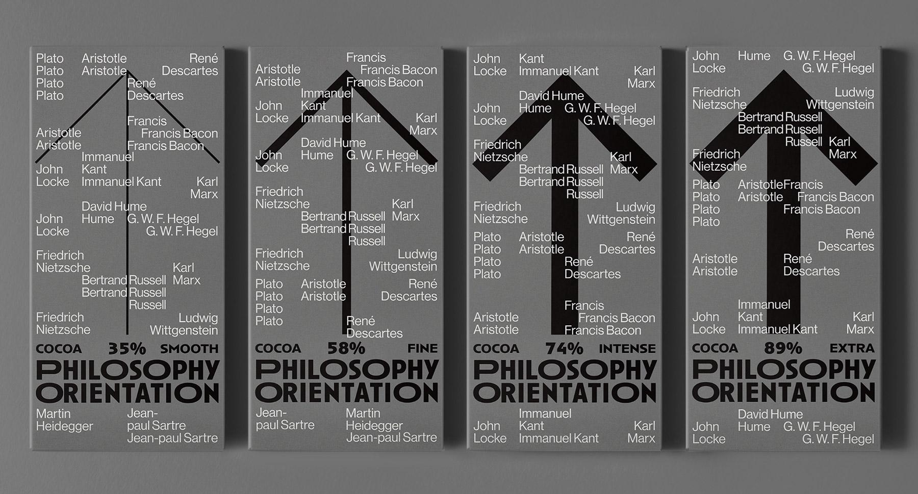
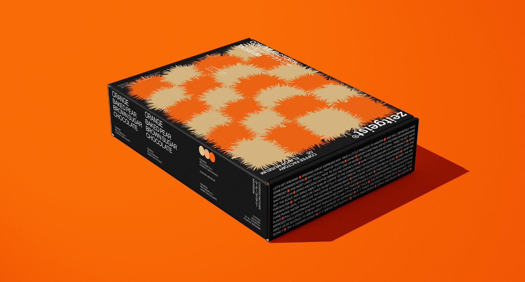
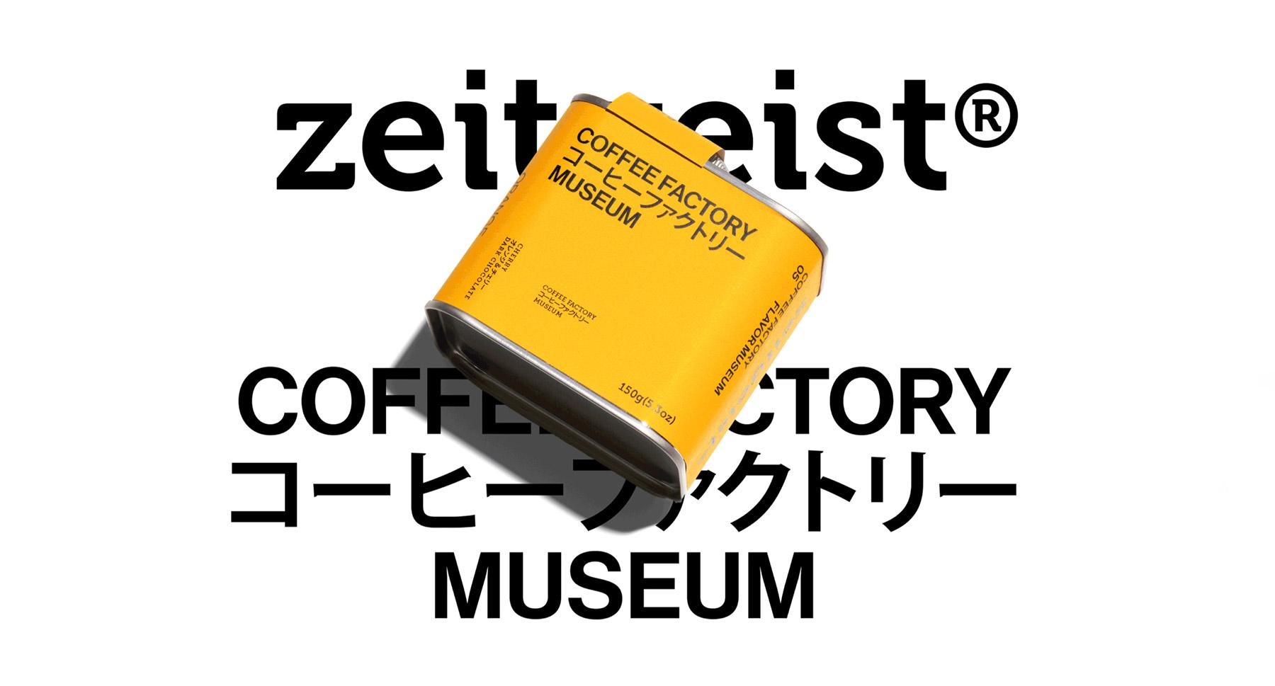
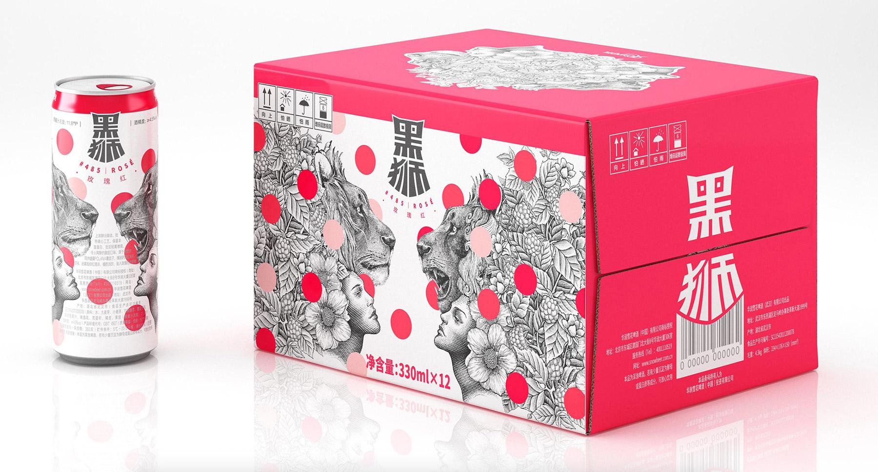
When looking at He Yuxuan and WhyNotDesing’s work, we can definitely see some go-to resources that can be qualified as their signature: vivid block colors, graphic pieces, typography-centered designs. And it all looks very modern, slick, experimental and attention grabbing. When you look at a design from WhyNotDesign, you know you’re looking at a design from WhyNotDesign, and that’s the whole point. Most of the packages they have designed look like they came from a frame of ‘Akira’ (1988) or ‘Cowboy Bebop’ (1998), and that’s why we love them.
Sources:
All images attached to this article are not property of Lorem Ipsum and were crafted by the artists mentioned above.


